Tuesday, 29 September 2009
Feedback #1 Deadline 21/9
Well done Mike for catching up with work this week. I can see how you have experimented with levels, tone and colour to improve an image rather than transform it. Can you please add screenshots of Photoshop to show levels and hue/saturation menus?
Hue and Saturation - Monochrome

This is a photo i took of my friend at school and i like that he has covered his face up and so decided to change the mood of the photo by converting it to monochrome. 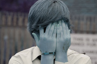 Using the rectanglualr marquee tool i selected the entire image as i wanted to make the whole image monochrome giving it a slightly washed out look. I changed the Hue of the photo to +180 which was a strong blue colour. I changed the saturation to -50 and the Lightness to -10 to make it look a light blue feel to the photo.
 Using the rectanglualr marquee tool i selected the entire image as i wanted to make the whole image monochrome giving it a slightly washed out look. I changed the Hue of the photo to +180 which was a strong blue colour. I changed the saturation to -50 and the Lightness to -10 to make it look a light blue feel to the photo.
 Hue and Saturation Adjustment
 I took this photo in some feilds near my house, as soon as i saw how it had come out i thought it needed to be edited in order for the light from the sun to have its full effect.
 Using the rectangular marquee tool i selected the entire image on a new layer. I wanted the colours of the image to be bolder and deeper so i firstly adjusted the Hue to -10; a more peachy colour. I then adjusted the Saturation to +29 to intensify the colour and i only changed the Lightness to +1 so it was that bit lighter.
On the 3rd and final layer i then adjusted the 'Brightness/Contrast' of the photo to exagerate on the existing colours. I changed the Brightness to -30 to making the image look correctly exposed. I finally changed the contrast to +30 to define and strengthen the content of the image.
Monday, 28 September 2009
Image Editing - Levels
 I edited the far left image that was taken in Chilie. There is a contast of the land/road and the sky making this a good photo for demonstating levels. I decided that i would edit the road and the sky on different levels.
  The next shows the second layer that i created. Using the 'Rectanglular Marquee tool' i selected the road and surrounding land. I used a feather of 50px for a smoother area of selection. With this area selected i opened 'Adjust Hue/Saturation'. I changed the Hue to -10 for a different tone of red; i changed the Saturation to +49 for a richer deeper colour and Lightened the road to +4.
  The final photo shows the finished edited image with all 3 layers. This time i used the 'Magnetic Lasso tool' and carefully selected the whole sky to the horizon excluding the closest telephone post. This time i used no feather to ensure presion with my selection. I opened 'Adjust Hue/Saturation' and changed the Hue to +6 for a slightly purpley blue; Saturation to +7 to make the colour slightly more intense; and the the Ligheness to -5 to make an even richer blue.
Subscribe to:
Comments (Atom)